LE PRIVÉ
Le Prive is a refined sanctuary for New York’s creative community—an exclusive space where members gather to connect, explore, and unwind. Tasked with revitalizing Le Prive’s brand identity, LMTED crafted a cohesive and inviting aesthetic across its three divisions, reinforcing its role as a cultural cornerstone and cherished haven for members.
The refreshed brand embraces candid moments, effortless elegance, and a touch of intrigue, capturing the authentic spirit of Le Prive. With thoughtfully chosen font pairings that blend decorative flair with timeless sophistication, the new identity celebrates community in its rawest, most genuine form.
Client
Le Privé
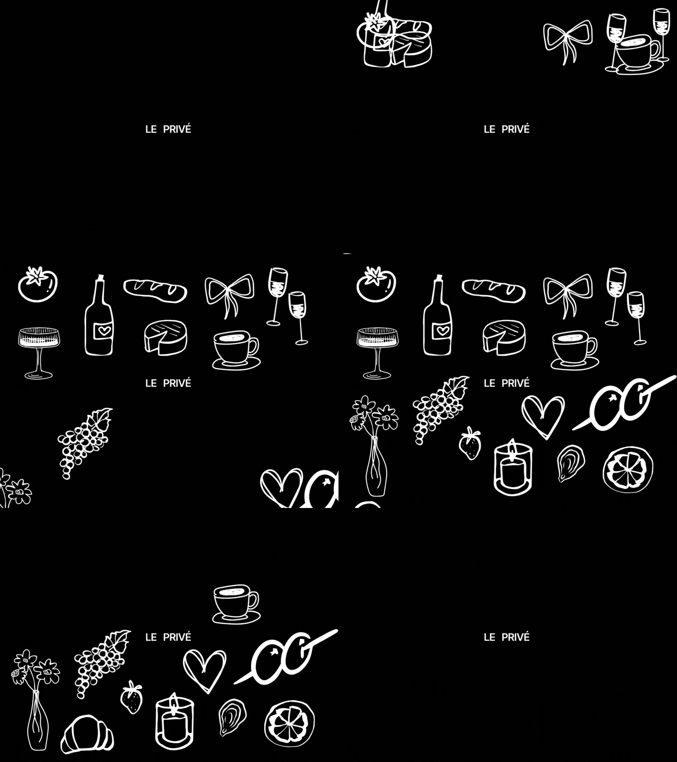
Hand-drawn illustrations enhance the brand’s identity, inspired by the art of leisure and intentional living. These thoughtfully imperfect visuals bring a touch of authenticity, embodying the spirit of slow moments and genuine connection.
Le Prive invites members into an elegant retreat designed for connection and relaxation. Rooted in a sense of familiarity, the brand retains a classic serif as its signature font, softened with a lighter weight to evoke warmth and sophistication.
Neuedays
NEUEDAYS serves as an exclusive sanctuary for those who appreciate quiet luxury and bold exclusivity, seamlessly curating spaces that inspire, connect, and elevate. Entrusted with enhancing NEUEDAYS' brand identity, we crafted a cohesive aesthetic that harmonizes across each collection, reinforcing its role as a destination of rare elegance and discerning taste.
The renewed brand embodies an effortless sophistication with a hint of intrigue, capturing NEUEDAYS’ spirit of understated luxury. Using thoughtfully selected font pairings that marry classic sophistication with a contemporary edge, this identity celebrates individuality and subtle expression, creating a true haven for those who seek meaning in rarity and community in curated authenticity.
Client
Neuedays
NEUEDAYS, The Bazaar is an exclusive marketplace for connoisseurs of quiet luxury and bold expression. This curated space brings together a collection of rare, meticulously chosen items from undiscovered markets, offering a unique blend of artistry, craftsmanship, and cultural depth. With an emphasis on individuality and understated elegance, The Bazaar invites members to explore pieces that speak to a refined aesthetic and a love for the uncommon.
Designed to be more than just a marketplace, The Bazaar is a haven for those who value authenticity and cherish the stories behind each piece. With NEUEDAYS’ signature blend of timeless style and modern exclusivity, The Bazaar transforms shopping into a curated experience, where every item is a testament to rarity and refined taste.
SMASHED
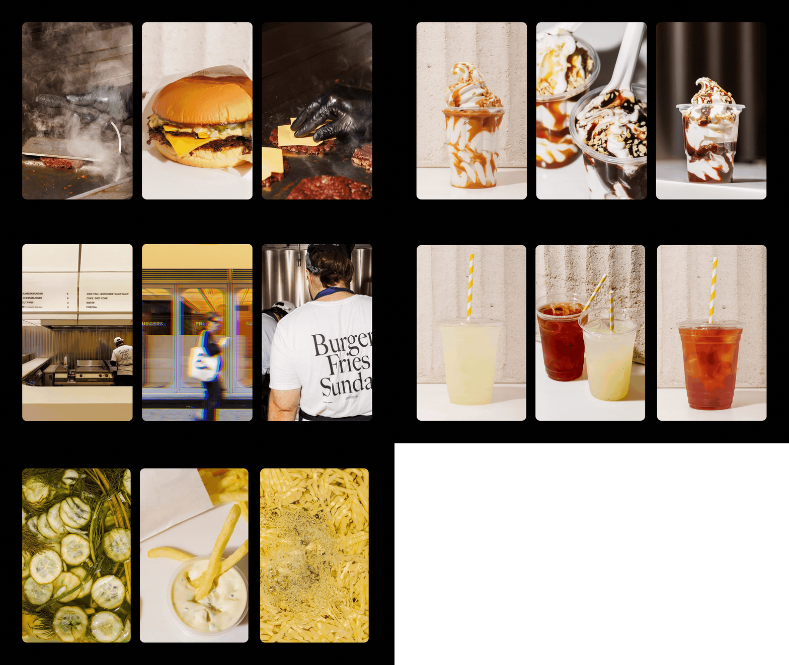
Smashed redefines the timeless appeal of burgers, fries, and sundaes with a fresh, minimalist twist. This isn’t just a place to eat; it’s a destination for those who crave authenticity and simplicity done right. LMTED was entrusted with crafting a brand identity that captures the bold yet unpretentious nature of Smashed—celebrating the art of the smashburger with a clean, no-fuss aesthetic.
The identity is defined by straightforward typography, a muted color palette, and subtle design details that reflect the straightforward menu. Every element, from the packaging to the signage, embodies Smashed's commitment to quality ingredients and a memorable dining experience. This is comfort food elevated, where nostalgia meets modern taste in a space that’s as effortlessly cool as the food is delicious.
Client
Smashed
No Pulp
No Pulp is a vibrant sanctuary for health-conscious individuals who value authenticity in every sip. This smoothie and juice bar celebrates the purity of real ingredients, crafting flavors that resonate with freshness, wellness, and transparency. Tasked with bringing No Pulp’s brand identity to life, LMTED crafted a cohesive and invigorating aesthetic that speaks to both health enthusiasts and casual drinkers alike.
The reimagined brand identity captures the lively essence of No Pulp, merging bright, playful visuals with a grounded commitment to quality. Bold and clean typography conveys the simplicity of real ingredients, while the color palette reflects the natural hues of fresh fruits and vegetables. This identity radiates energy, vitality, and a refreshing sense of well-being, turning each visit to No Pulp into an experience of genuine flavor and feel-good choices.
Client
No Pulp


